 Blow Up The City Wiki
Blow Up The City Screenshots
Every image the developer published on the game's Roblox page, at full width, with a note on what each one actually shows.
In-game screenshots
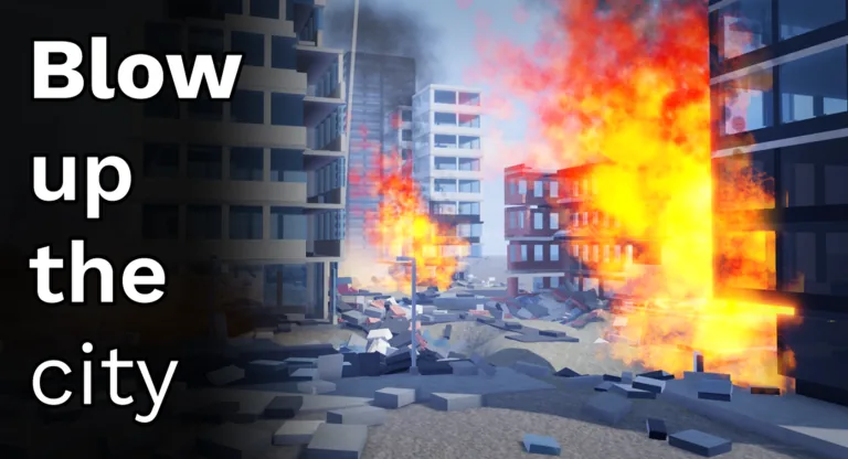
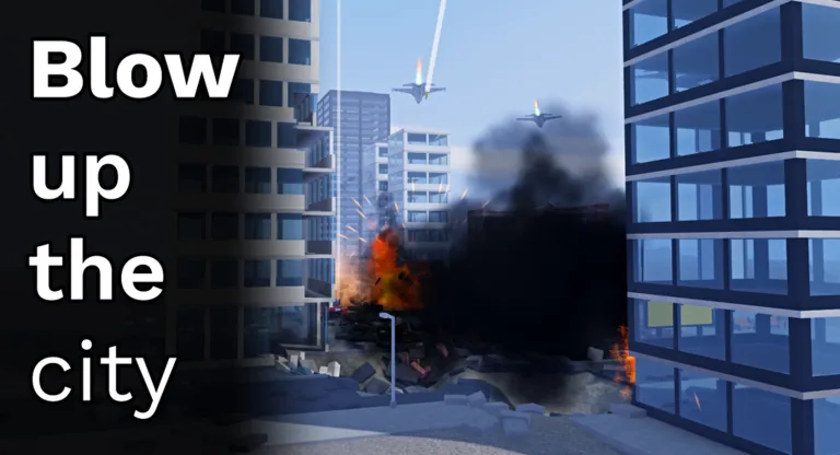
What these tell you before you play
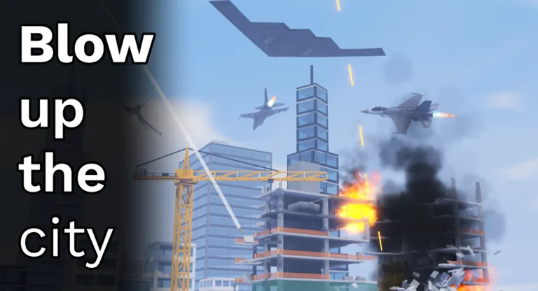
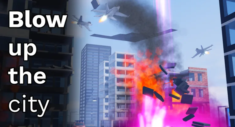
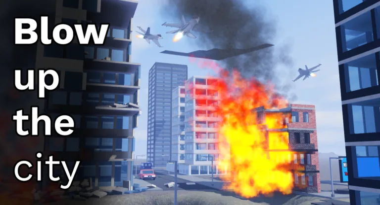
What the five official thumbnails have in common, having read each one at full size: a modern city of glass towers and blocky apartment buildings, one partially built high-rise with its floor slabs left exposed, a yellow tower crane, explosions with orange fire and heavy black smoke, debris thrown clear of the blast, and aircraft in the sky above the streets.
The main thumbnail concentrates the whole premise into one frame. Fire and black smoke pour out of the upper floors of the unfinished tower while chunks of it fly outward, a large dark bomber silhouette sits high in the sky, jets cross the frame with lit exhaust, and the game's title is stacked in white on a dark panel down the left edge.
Two details are easy to miss. One street-level frame contains bright magenta light alongside the orange fire, which is the most saturated colour anywhere in the official art and the reason this site's accent colour is reserved for very little. And every image carries the same title panel over its left third, so the panel is covering part of the scene in each one.
What these images do not show, after looking at all five: no rail line or train, no bridge, no tornado or wind effect, no earthquake crack, and no player characters or interface at all - not a health bar, not a cash counter, not a single button. For a game whose economy is the whole point, that is a striking omission, and it is why the figures elsewhere on this site come from Roblox's API rather than from the art.
Why the image count is what it is
Roblox gives a developer a fixed number of image slots on their store page, and most games use them as advertising rather than documentation. That has two consequences for anyone reading a game's pictures to work out what it is like.
The first is that the images are chosen, not sampled. Every frame is the most flattering one available, which means a game with a boring core loop can still look eventful, and a game whose appeal is in slow progression will photograph badly. The second is that the set is small and static: a game that adds content for months often keeps the same handful of promotional images, so a store page can lag the game by a long way. A description is usually updated sooner than the art is.
That is why our guides are built from the developer's description and from Roblox's own records rather than from its screenshots. This game's badge list is empty, so there is no badge record to read — which is itself worth knowing, and it is stated where it matters rather than here.
How to read a Roblox store image
Three things are worth looking for, in this order:
- Interface elements. If a counter, a currency or a health bar is visible, that tells you what the game measures. If none is visible, the image is marketing rather than a screenshot, which is the most common case.
- How many players are in frame. A co-op game photographs its group; a solo game photographs one character. This is a rough but useful signal about the shape of the game.
- What the environment implies. Open water, a city, a single room — the setting is usually the most reliably reported thing in promotional art, because it is the hardest to exaggerate.
What is not worth reading from these images: prices, drop rates, tier lists, or how strong anything is relative to anything else. None of that photographs.
Artwork and screenshots are the property of Airstrike Industries and are reproduced here at reduced size for identification and commentary.